Laura Ashley fitted kitchens and bedrooms are designed for homes that are lived in, not just looked at. In busy households, furniture needs to cope with everyday use while still feeling considered and comfortable. That’s why homeowners renovating kitchens and bedrooms often turn to Laura Ashley, not only for the look, but for how well the furniture continues to perform over time.
At Panararmer, we work with homeowners across Cumbria and the South Lakes who want spaces that feel well thought through and lasting. Laura Ashley furniture fits naturally into that approach.
One of the biggest advantages of Laura Ashley furniture is how easily it translates across rooms. Homeowners often want continuity between spaces, especially when renovating more than one area of the house.
Laura Ashley fitted kitchens and bedrooms share the same design language, which makes it easier to move from a kitchen project into a bedroom renovation without the house feeling disconnected. Cabinet styles, finishes, and colour palettes work together rather than competing, creating a calm, cohesive feel throughout the home.
This makes Laura Ashley furniture works well if a home is being updated in stages but still want everything to feel connected.
If you’re planning more than one room, you can take a look at our Laura Ashley kitchens and Laura Ashley bedroom ranges to see how the collections sit together.
Laura Ashley designs have always leaned towards balance rather than bold statements. The appeal is more about choosing something that feel right long term.
In both kitchens and bedrooms, the detailing is subtle but thoughtful. Framed doors, soft curves, and proportioned cabinetry mean the furniture doesn’t shout for attention, but it doesn’t fade into the background either. It’s the sort of style that works just as well in traditional home as it does in a newer build, especially for homeowners who want their renovation to still feel right years down the line.
Storage is one of the first things people think about when planning a kitchen or bedroom, and one of the easiest things to get wrong.
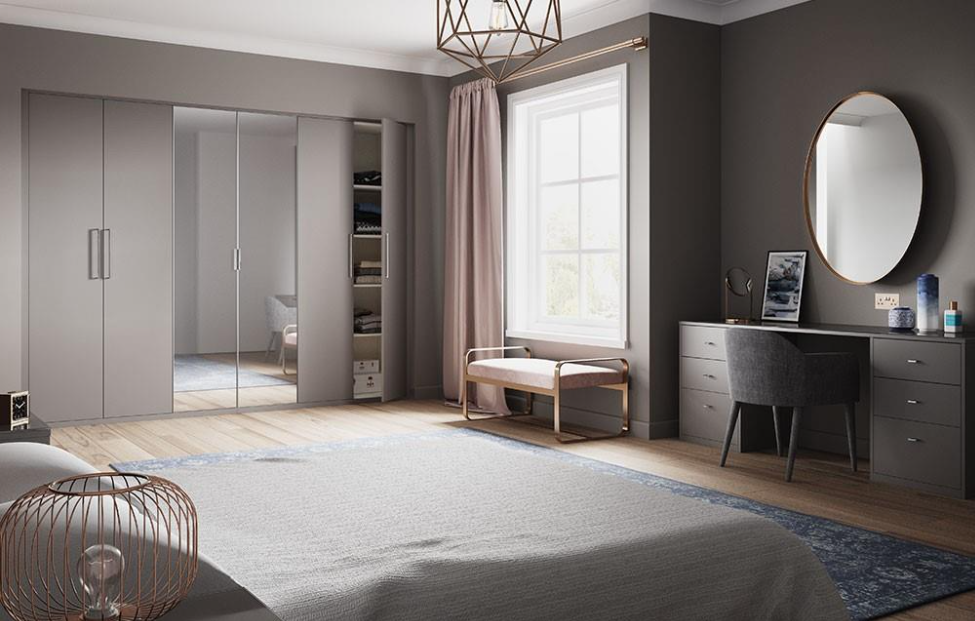
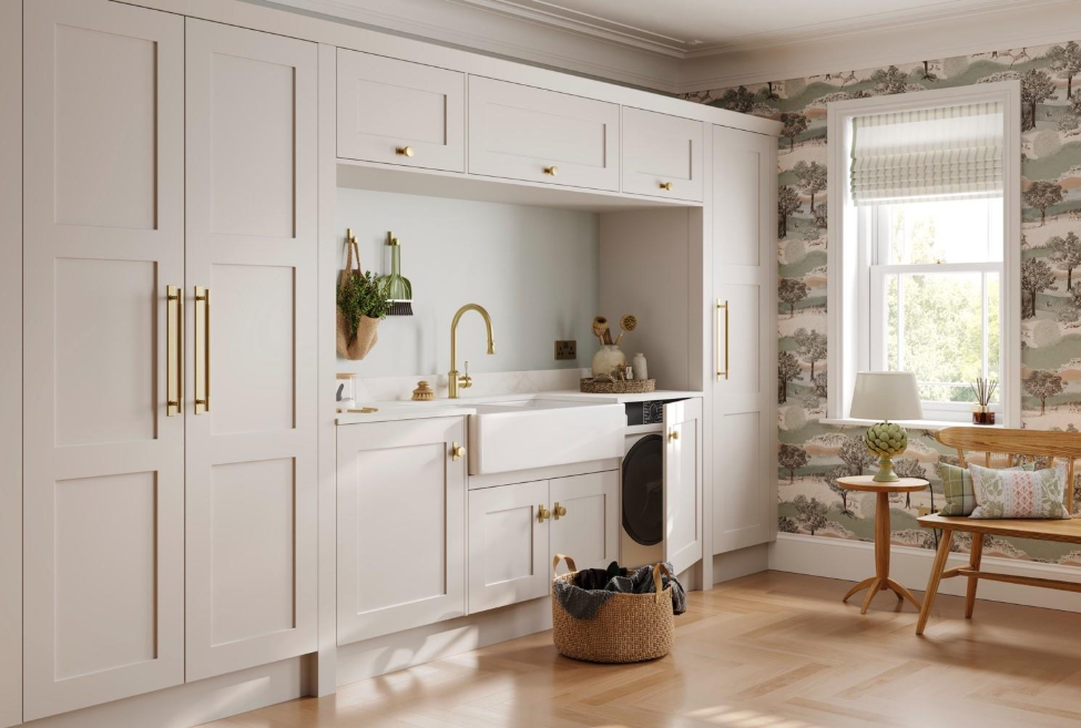
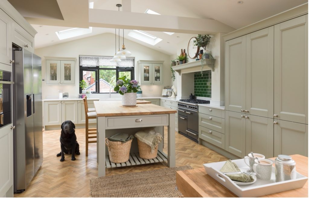
Laura Ashley furniture is designed with practical use in mind. Kitchens include well-proportioned cabinets that make sense for everyday cooking, rather than awkward corners or impractical layouts. Bedrooms offer fitted wardrobes, combination units, and internal storage options that help make use of space properly, especially in rooms with sloping ceilings or tighter layouts.
At Panararmer, we design Laura Ashley furniture around the room itself, so storage feels intentional rather than added on at the last minute.
Choosing colours can feel overwhelming, particularly for larger fitted furniture. Laura Ashley’s colour palette is one of its quiet strengths.
From soft neutrals to deeper tones like cobble grey or platinum, the colours are designed to bring warmth without overpowering a space. They work well with natural light, changing gently throughout the day rather than feeling flat or harsh.
The finishes are practical too, designed to cope with everyday use rather than needing constant upkeep. Whether paired with traditional handles or more understated hardware, the result feels balanced rather than overworked.
Laura Ashley furniture is made to cope with real use, drawers opened daily, wardrobes filled properly, kitchens that are used every day, not just made to look good.
Solid construction and quality materials mean the furniture feels reassuringly sturdy without looking heavy. This is particularly important in kitchens, where cabinetry needs to stand up to heat, moisture, and constant movement, and in bedrooms where smooth running drawers and doors make a noticeable difference over time.
Choosing the furniture is only one part of the process, how it’s designed, fitted, and finished makes just as much difference.
At Panararmer, we handle the full design and installation of Laura Ashley kitchens and bedrooms. Layouts are planned carefully, storage is adapted to your space, and smooth installation by our fitters, from cabinetry to worktops too lighting and finishing details. Because the design and fitting are handled together, the final results feel cohesive and well thought through, rather than pieced together in stages.
You can take a look at our Laura Ashley kitchen options and Laura Ashley bedroom ranges on our website to get a proper feel for how the collections would work in your own home.
Visiting our Panararmer showroom allows you to see Laura Ashley’s ranges, colours, finishes and design up close, so you can visualise your space better, as they tend to make more sense in real life than they do online. You can also talk through ideas with our expert design team. Whether you’re planning a full kitchen renovation, updating a bedroom, or simply gathering ideas for a future project.
If you’re considering a Laura Ashley kitchen or bedroom in Cumbria or the surrounding areas, make sure you pop into our showroom in Milnthorpe or get in touch to arrange a design consultation. We’re always happy to talk through options and help you decide what will work best for your home.